The following scenarios are ones many of us run in to:
- Lumped Sum: I suddenly got $30,000. Should I put the money towards my mortgage, or should I invest it?
- Periodic Payments: After all my monthly bills, I have $500 left over. Should I put it all towards my mortgage, or should I invest it?
People have strong beliefs about this. The usual answers are variants of the following:
- It is not all about the money. Paying off the mortgage early lets you sleep better at night.
- If your interest late is low, you will end up making more money by investing it in the long run.
- Putting it in your home is a guaranteed “profit”, with a well defined rate of return (your interest rate).
- Would you borrow money to invest it? If not, you should pay off your loan as soon as possible — you are effectively living on borrowed money until you do.
Let’s focus on item 2 above, and look at the S&P 500 performance.
S&P 500 Analysis [1]
I took the well known Shiller data to get the history of the S&P500. [2]
The question I want to tackle: If someone invested in the S&P 500 for a 10 year period, what effective annual rate of return did she get throughout history? If she invested from 1980 to 1990, what was her effective rate of return? Or from 1985 to 1995?
I looked at 5, 10, 20 and 30 year periods. I also assumed all the dividends were being reinvested back into the funds, [3] as is common with most mutual funds. I ignored fund fees and taxes for this analysis.
Caveat
Quick question: If one year I lost 20%, and the other year I gained 20%, what was my effective annual rate of return? If you think it is 0 (mean of -20 and 20), you are wrong. It is actually close to a 2% loss. Can you guess why?
Lumped Sum Analysis
Let us assume we are dealing with the lumped sum scenario above.
I’ve plotted the annualized rate of return for a lumped sum investment over different investment periods.
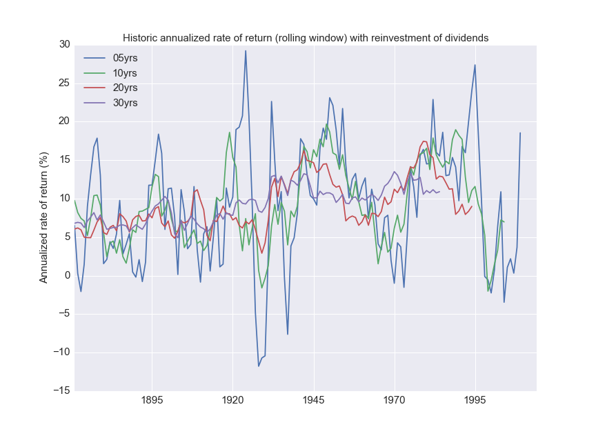
To understand the plot, look at, say the 30 year value in 1970. That value is the effective annual rate of return for the S&P500 over 30 years beginning in 1970. This is why the 30 year curve stops earlier than the 5 year curve.
A few things stand out:
- The lower the investment interval, the higher the volatility.
- The 20 and 30 year periods never resulted in a net loss.
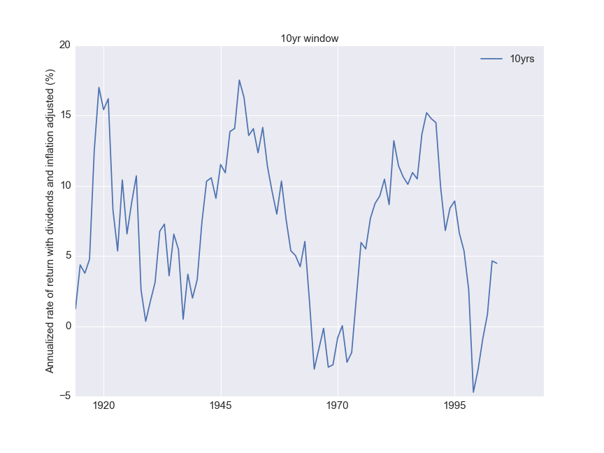
Since the plot is busy, below are the individual curves:


Inflation
There is one item missing from the analysis above: It does not take into account inflation. What is the inflation adjusted effective rate of return?


Discussion
For the lumped sum scenario, note that since some time shortly before 1920, not once in the history of the S&P 500 did a lumped sum investment over a 30 year period dip below 4%. How does that compare to your mortgage interest rate?
Periodic Payments
Let’s consider the other scenario, where you are contributing monthly. What do the curves look like then?
Without Inflation
The plots below ignore inflation.
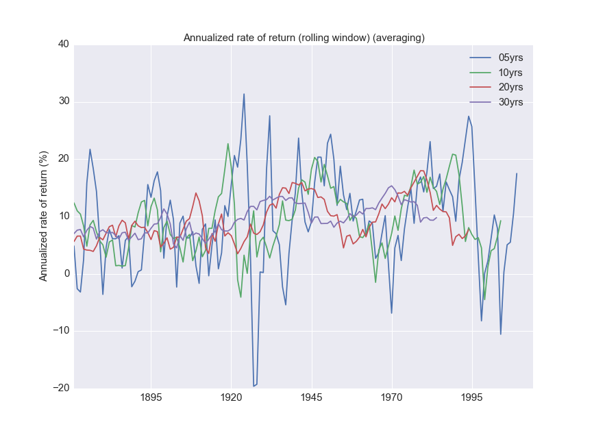
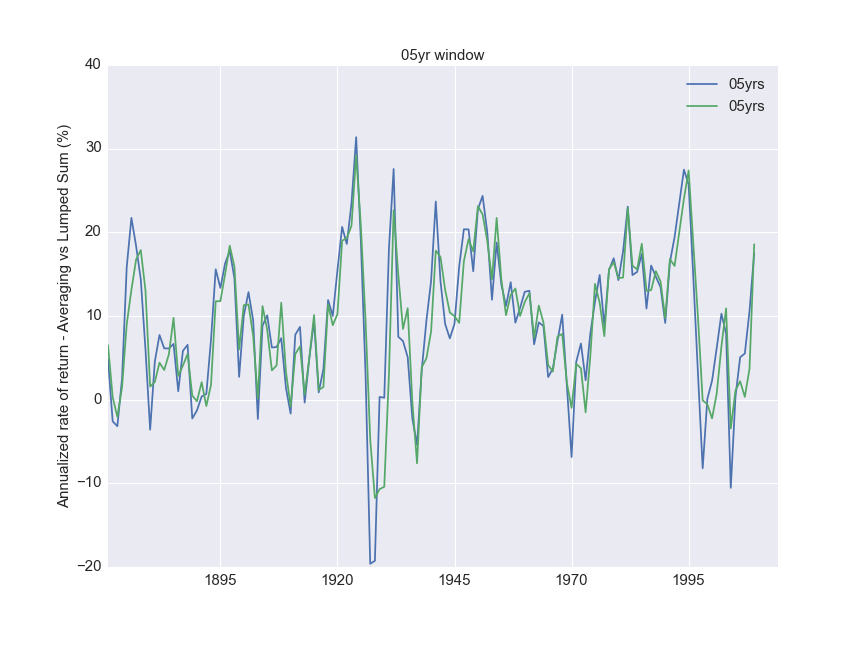
How does this compare with the lumped sum returns? The blue curve in the following plots is for periodic payments.


With Inflation
The plots below are inflation adjusted for periodic payments:


Discussion
Similar conclusions apply as with the lumped sum, although the bottom for the 30 year period was lower than with lumped sum. The peaks are higher as well.
Monte Carlo
In the analysis above, I looked at consecutive years. Is that adequate? Looking at 30 year intervals with inflation, I have less than 100 data points. Also, many feel the correlation of the S&P 500 from one year to the next is virtually nonexistent. So why look at consecutive years?
I decided to use the actual annual rate of returns for all the years I had, and sample from them. So for a 20 year period, I randomly picked 20 years, and computed the effective annual rate of return.
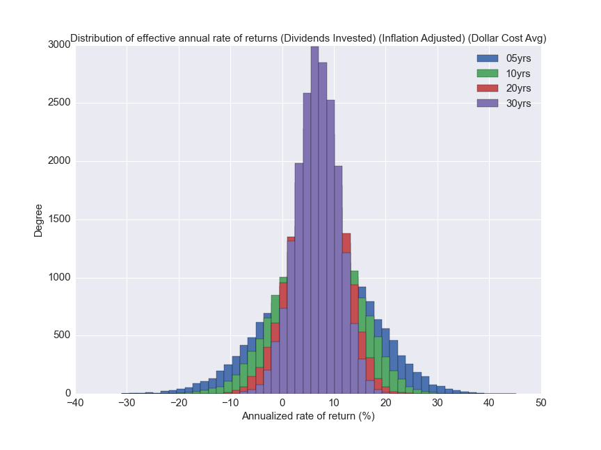
For convenience, I included inflation in the Monte Carlo simulations.
Lumped Sum

We immediately see that the longer the investment period, the lower the variation in the effective annual rate of returns.
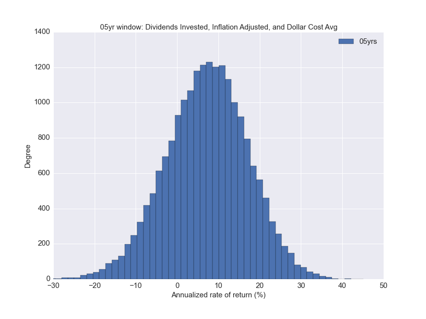
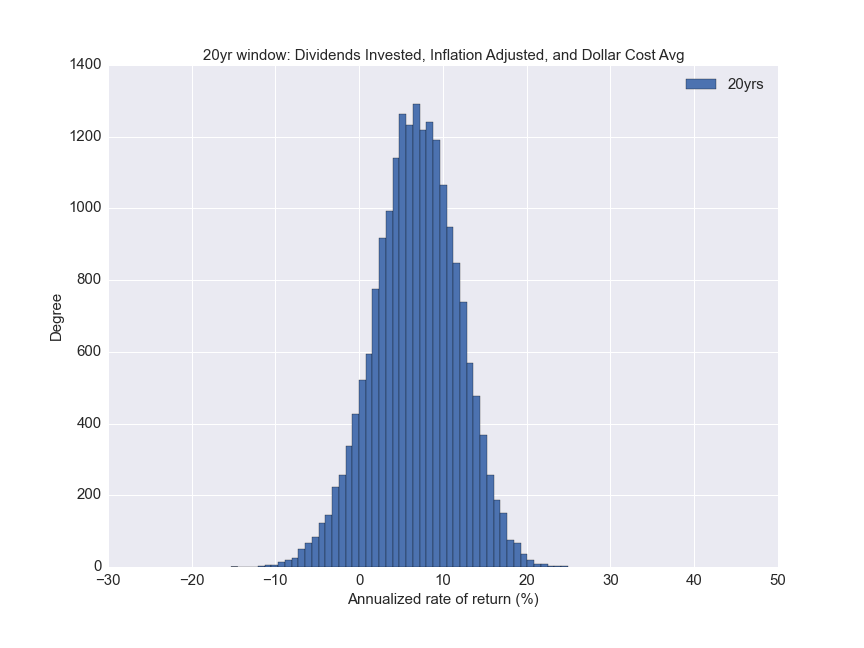
Below are the individual histograms.


Below is a table with the various quartiles of the distribution.
| . | Average | 25% | 75% |
|---|---|---|---|
| 5 Years | 6.85% | 0.62% | 13.1% |
| 10 Years | 6.66% | 2.27% | 11.1% |
| 20 Years | 6.59% | 3.49% | 9.7% |
| 30 Years | 6.54% | 4% | 9% |
Periodic Payments
Below are the individual histograms.


| . | Average | 25% | 75% |
|---|---|---|---|
| 5 Years | 7.23% | 0.67% | 14% |
| 10 Years | 6.89% | 2.21% | 11.8% |
| 20 Years | 6.82% | 3.55% | 10.3% |
| 30 Years | 6.82% | 4.16% | 9.63% |
Discussion
While the stock market may seem like a scary, risky place, it is so mostly in small time intervals. You could lose a lot of money if you invest for 5 years. But as you increase the investment period, the curve smoothens out, and is less risky. Large fluctuations remain from year to year, but in the long run the gains are more than the losses: You just need to remain committed.
Taking Loans to Invest?
I want to end this post with a note on one of the other responses:
“Would you borrow money to invest it? If not, you should pay off your loan as soon as possible — you are effectively living on borrowed money until you do?”
First, I’ll point out that yes, many people do borrow to invest. People borrow to start businesses.
But even if one is not prone to borrowing to invest, this argument is a good example of the sunk cost fallacy. I may not borrow money to invest, but the situation is not one where I have not borrowed money. Once you have a loan and cannot get out of it easily (i.e. you wish to keep the house), you pick the option that gives you the greatest expected returns.
I would not borrow money to go on a vacation, either. Yet most homeowners will spend money on vacations while under a mortgage. We do not see this as strange. It is no different if you decide to invest it.
Of all the reasons cited above, this is the only one that struck me as plain invalid.
| [1] | All this analysis was done in a Jupyter notebook. The archive has all the data as well. I’ve also uploaded an HTML version of the notebook with more plots. You can find a more detailed explanation of all the calculations, with associated equations used. |
| [2] | My specific sources were http://data.okfn.org/data/core/s-and-p-500#data and http://dqydj.net/sp-500-return-calculator/ |
| [3] | I’m not entirely sure I calculated the reinvestment of dividends properly. I used a method in one of the links, and the results were similar. Any other interpretation I could come up with from the Shiller data resulted in higher returns, so I stuck with this as a conservative estimate. |
Comments
You can view and respond to this post in the Fediverse (e.g. Mastodon), by clicking here. Your comment will then show up here. To reply to a particular comment, click its date.